Colophon
I have seen lots of blogs with a Colophon page, so I don’t want to miss out on the geekery of believing this blog is a truly faux-published work of electronic literature.
Honestly, the first time I remember realizing what a colophon actually was would be getting my first O’Reilly programming book, which was Learning Perl with the llama on the cover. The colophon basically describes the freakin llama!
Anyway, a blog colophon seems to describe the blog internals. It also preserves a bit of the blog history with respect to design and iteration which isn’t necessarily appropriate to track with details in the Changelog.
Current plugins
 Akismet Anti-spam: Spam Protection 5.3.7
» Automattic - Anti-spam Team (url)
Used by millions, Akismet is quite possibly the best way in the world to protect your blog from spam. Akismet Anti-spam keeps your site protected even while you sleep. To get started: activate the Akismet plugin and then go to your Akismet Settings page to set up your API key.
 Customizable Comment Listings 2.0
» Scott Reilly (url)
Easily find comments (including pingbacks and/or trackbacks) or commenters and list and display anything about them or their related post in the manner you want.
 Database Backup for WordPress 2.5.2
» Delicious Brains (url)
On-demand backup of your WordPress database. Navigate to Tools → Backup to get started.
 del.icio.us cached++ 2.0
» João Craveiro (url)
Outputs del.icio.us bookmarks. Uses Wordpress built-in MagpieRSS to retrieve and to cache.
 flickrRSS 5.3.1
» Dave Kellam (url)
Allows you to easily integrate Flickr photos into your site’s templates.
 Jetpack 14.5
» Automattic (url)
Security, performance, and marketing tools made by WordPress experts. Jetpack keeps your site protected so you can focus on more important things.
 Limit Posts 1.1
» Alfonso S�nchez-Paus D�az y Juli�n Sim�n de Castro (url)
Limits the displayed text length on the index page entries and generates a link to a page to read the full content if its bigger than the selected maximum length.
 Tylr Slidr 1.6
» Tyler Craft (url)
The Easiest Way to Pull Your Flickr Photos into Wordpress.
 WP-PluginsUsed 1.50.2
» Lester 'GaMerZ' Chan (url)
Display WordPress plugins that you currently have (both active and inactive) onto a post/page.
 WP Audioscrobbler 0.35 Beta
» Marc Hodges (url)
A way to list your most recently played tracks from your audioscrobbler/last.fm account.
 XML Sitemap Generator for Google 4.1.21
» Auctollo (url)
This plugin improves SEO using sitemaps for best indexation by search engines like Google, Bing, Yahoo and others.
If you are interested in other WordPress plugins not mentioned here, then I suggest you check out the WordPress plugins directory.
Blog history
(Click images for full-size views of designs)
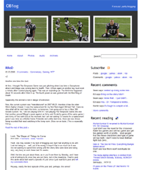
OB1og v4.0
:: 05.15.2008 – present
Finally, a true redesign from the ground up… and not live! Not at the start. Changes will be afoot as the shiny bits show up first and new features later, but the shiny bits were completely new pages and stylesheet… not much of anything carried over from previous iterations.
The big change is the single column layout and sidebar as a footer. I was always a fan of the sidebar in the footer from doing the original Ed Zone and I like the single column as a progression from previous iterations. I suppose in going from 3 to 2 to 1 I will have to go back to 3 for the next one. I hope everyone has a widescreen monitor like me by then. (Really, what are you waiting for?) Oh, and the Poloroids are back!
The Changelog will track changes to the overall site, but I’ll add some things here over the lifetime of this design.
OB1og v3.0
:: 04.15.2007 – 05.15.2008
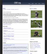
The start of a true live redesign, or the live redesign redux, was from a more basic layout and styling. It never got much further than moving the Asides in-line with regular posts (with slightly different formatting) and using larger images at the top of the homepage for the latest from Flickr. The font was really large to start, but eventually was reduced for the last few months since many thought it was too large. I kept the two column layout I moved to for the previous version and the items in the sidebar would change based on the context you were in rather than appear on all pages. At the same time, I moved away from putting images in most of the posts.
I wanted to add some features to keep things a little more fresh around the site, and I thought I’d incorporate them into this still live, though neglected, design. I later changed my mind after redoing The Ed Zone site. Funny how that keeps happening.
OB1og v2.0
:: 02.25.2007 – 04.15.2007
The start of an active/live redesign of the OB1og starts from the ZonEd 2.0 design. Changes will be tracked here and/or in the Changelog as appropriate. This idea was quickly abandoned in favor of starting from a basic layout and styling not even two months later, but still as a live redesign.
Other than using larger Flickr images and the gradient/header text, I didn’t like a lot about this from the start. It was very dark, not a bad thing, but in combination with all the lines, it seemed way too busy so I wanted simpler. I suppose the switch to the two column layout was good in that it allowed a bit more space for images in posts.
I never got a screenshot of it before I changed it over, so I took one the same last day as the *true* redesign design (OB1og 3.0).
OB1og v1.5
:: 04.22.2006 – 02.25.2007
The constructive criticism I received on v1.0 had me quickly rework the design into v1.5, which was of course a credit to my excellent coding skills! 😉
Seriously though, I basically changed to a *traditional* three column layout and removed the extra colors in favor of blue as the main theme with a splash of green in the footer and other little spots. All the same features I added for v1.0 were still present, so I just incremented a half release. You can read more about the refresher in Simplified OB1og.
I am writing this a little over three months after implementation, I am still happy with the design. I have instead focused on my content and completing the feature set. Autumn will likely bring a new design, or at the very least a color change!
OB1og v1.0
:: 04.13.2006 – 04.22.2006
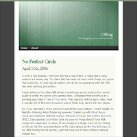
Just getting the blog out into the world proved to be enough to get me to focus on finishing my own design/template, but it turned out to be a totally new one than the one I had been wasting so much time on. Yeah, I busted this one out in a little over a week as compared to the other which took a month or so to not finish. Talk about motivation.
Anyway, I still have that old template and there’s a lot I like about it and it might make its way here some day in the future. That said, the first template I actually used found a bit of criticism, which I took constructively. I liked a lot of the elements about it, especially the three column layout, but having the two thin columns on the left was tough to handle after the initial introduction. The focus was too much on the blue bar in the middle instead of on the actual content. I joked that I had to dazzle with design since my content was crap and it turned out both were just crap (and still are).
The color inspiration was for the Spring colors associated with the Easter holiday. You can read more about the design in Spring Fresh OB1og.
OB1og v0.1
:: 04.04.2006 – 04.13.2006
This little blog that might was launched in the wee morning hours — 1:08:35 am est — this day with the Walk This World post. The blog used the Ambiru theme by Phu Ly because I liked it and I was taking to damn long to finish my own design/template. The Ambiru theme is a nice, simple, clean single column layout with the full posts showing on the home page and the navigation links and stuff in the page footers. Getting the blog launched without my own template proved to be the kick in the pants I needed to move forward.


 Posts ::